Do you consider yourself a tastemaker, and believe an impeccably styled and elegantly furnished clinic to be one of the driving forces behind your business’ success? (coupled with your incredibly talented staff or course!) You are not alone. Our Interior Inspo section features clinics that know what an overwhelming difference a spa or clinic’s carefully selected aesthetic can make to their bottom line, and strive to achieve visual perfection!
 Another of these is Aestheticá Byron Bay, whose popularity has grown exponentially since launching earlier this year. Situated within Byron’s Habitat Precinct, Aestheticá boasts a bright airy feel, glorious smooth archways and breathtaking custom pieces. We chat to Alexa Roetger (Founder) and Nakisha McHugh (Clinic Manager) about the inspiration behind the look.
How did you come up with your clinic’s aesthetic, branding, colour scheme etc?
We knew from the very beginning that we wanted to create a beautiful space which was completely different to the usual salon/clinic. We worked with a talented friend who is a graphic designer and the Aesthetica logo and curves were born. From there we rolled out archways, curves and clean lines that tied in with our logo for our interior design, which in a way has become a huge part of our branding also.

What did you want the style to say about you?
That we are a boutique clinic which values good design with no expense spared. This is also reflected in the treatments we offer. Every care is taken to create a seamless experience with all the little extras built into your treatment. We wanted to throw away the rule book for how an injectables/skin clinic should be and instead execute good and well considered services and design. Being based in Byron Bay means we are surrounded by so many creatives and the options for locally sourced bespoke items was endless.
What do you want clients to feel upon entering the space?
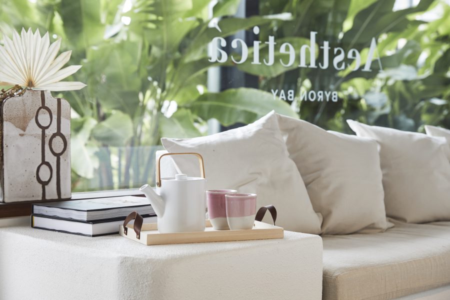
An immediate sense of calm, warmth and healing. With our bagged white render walls, upwards lit archway, arched doorways, abundance of natural light and live flora, it really is almost impossible to feel anything but relaxed in the space.

How large a role do your stocked brands’ aesthetics play within your clinic? Did the look of their packaging impact on your selection when choosing brands to stock?
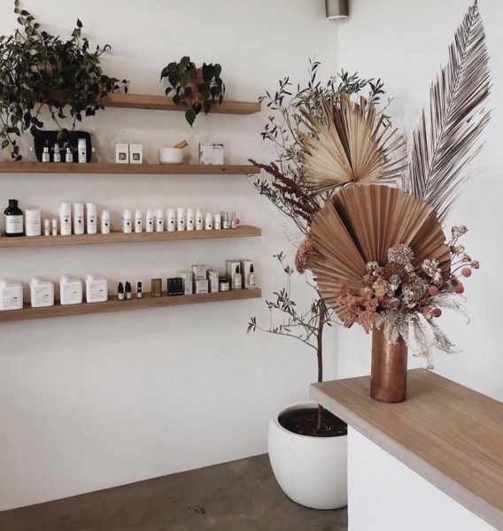
No. The packaging of our stocked brands was never a consideration for us. Our only focus when it came to skincare and supplements is products which deliver real results above all else. Fortunately, dermaviduals was our first choice and their clean, straight forward branding aligns perfectly with ours.
What kind of feedback do you receive from clients about the space?
The greatest thing which we didn’t expect is that upon entering the space clients always have a wow moment and pull out their phone, snap a photo and share it on social media. We had no idea to expect this and in turn the image was shared 1000s of times over the last year and gave us a tonne of user-generated content and exposure.
Any favourite decor and/or furniture items?
We have quite a few! As we engaged local artisans to create bespoke furniture and pieces for us – such as our curved in-built waiting area seat – created by The Dusty Road, a local upholsterer and hand-made ceramics by Mel Lumb Ceramics and Lunio by Sofie – not to mention our beautiful fortnightly floral instalments by Bower Botanicals.


